
How redesigning a robust yet dated HRMS B2B SaaS product boosted adoption rates by over 50%
Detailed case study
My Role
Leading the project, Mentoring the Jr. Designer, SPOC for the client
The Team
1 Principal Designer, 1 Lead Designer, 1 Jr. Designer, CEO & MD, CTO, PM, Engineering, Marketing
Timeline
2 years (2022-24); The product is being rolled out in India and abroad
Process
Design Framework · Taskflow Overhaul · Design · Design system · Support
Revamped a very complex SaaS product • Guided a seasoned team through transformation • Earned a retainer client
Overview
Adrenalin eSystems asked us to give their 20-year-old HRMS enterprise software product a facelift. After closer inspection, we recommended a complete overhaul instead.
With the plethora of HRMS products available today, we could only succeed by giving this mammoth system a user-centred redesign along with a modern and fresh facelift.
This effort required a parallel transformation of the product owners and developers through empathy and tact.
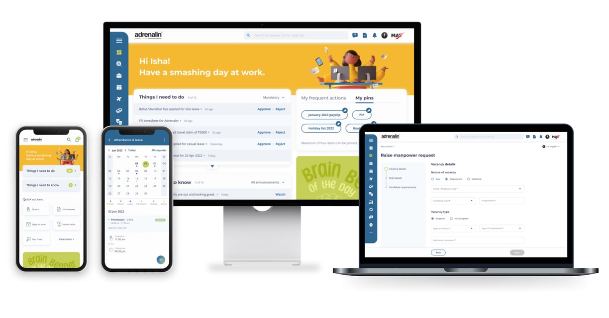
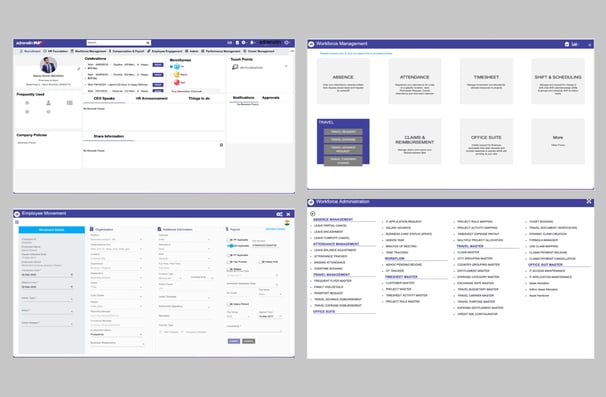
Original product screens

It is always difficult to make things simple. The redesign has helped us position the product with much larger enterprises. Your team played the role of ‘change agents’ to perfection.
MD & CEO, Adrenalin eSystems

It was indeed a great journey. Your team was very professional, knowledgeable, approachable, flexible, quick in response, consistent and delivered a good quality output.
Chief Product Officer, Adrenalin eSystems

★★★★★
★★★★★
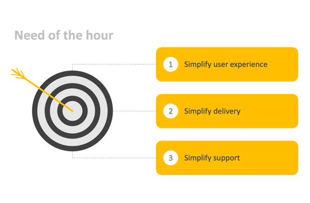
The Problem
HRMS systems are indispensable but aren't sufficiently employee-friendly.
Most employees find their HRMS complex and feel that using it is a chore. We recognized the need to change this perception. While many HRMS platforms appear simple and minimalist, they cannot often handle complex transactions at scale or across borders.
Adrenalin had the required horsepower to perform at scale. All it needed was best-in-class UX.
The Constraints


Product Team's attachment to legacy system
No time for user research due to tight deadline
System setup based on highly complex admin module
Delay in going live due to extensive training requirements
Visual Dimension Exercise
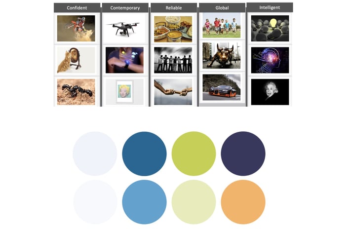
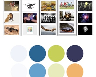
We engaged the clients in a visual exploration exercise, starting with a list of descriptive words from which they selected the top five that best resonated with their brand. Next, they chose images that connected with each word.
This process revealed patterns in primary and secondary colours, ultimately shaping the classic palette for the product.
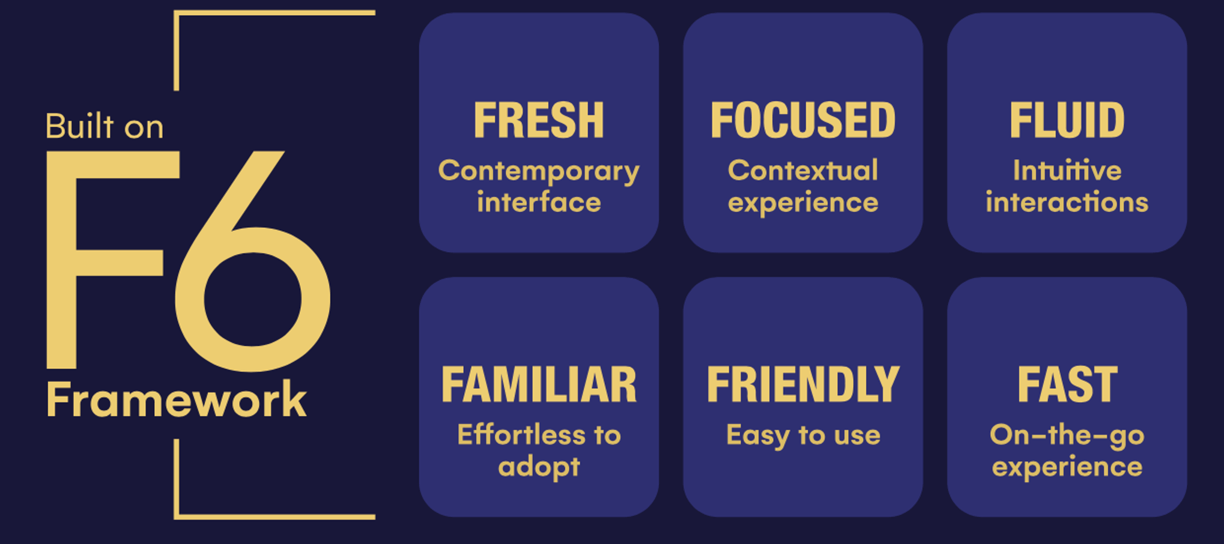
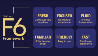
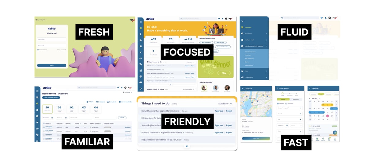
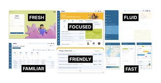
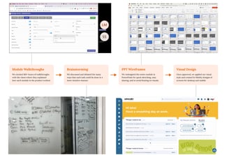
Design framework that can be used to create any HRMS
Task Flow overhaul process
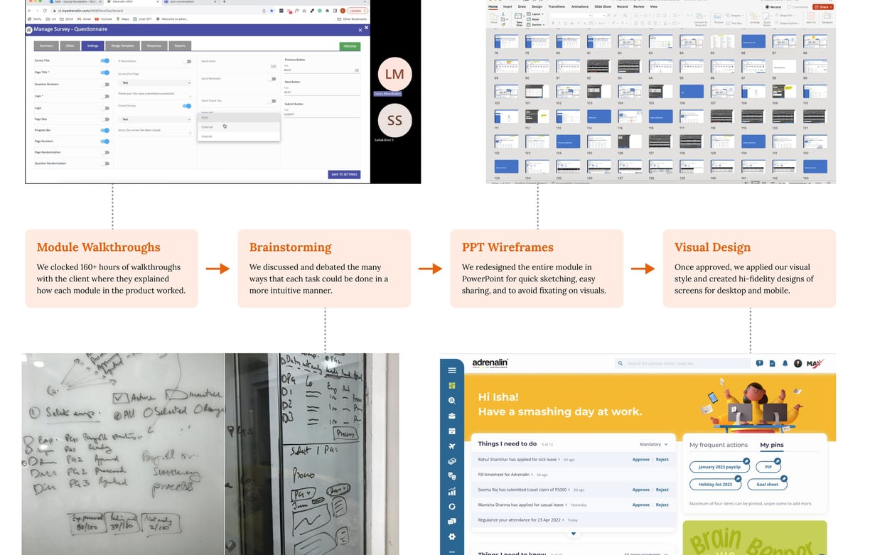
We impacted the cultures of our client and their customers
We templatized everything and reduced the number of page types from 27 to 6 in some cases
We educated developers about how every single pixel on the screen contributes to UX
We provided the product team with all the ammunition they would need to launch and market the upgraded design
We designed a patented element which allows users to fast-forward or rewind to any step in a lengthy process with ease.
Detailed screens cannot be shared here due to NDAs.
The Outcome of our Solution
We built a comprehensive design system to simplify and streamline the development of our complex HR tech platform. Before this, inconsistent UI patterns and redundant code slowed teams down. Now, with standardized components and a centralized approach, we’ve transformed how we work.
Key benefits:
Faster development – reusable components speed up iteration
Consistent UI – seamless user experience across the platform
Better collaboration – designers and developers work in sync
Scalability – future-proof foundation for growth
Improved accessibility – ensures inclusive, user-friendly design
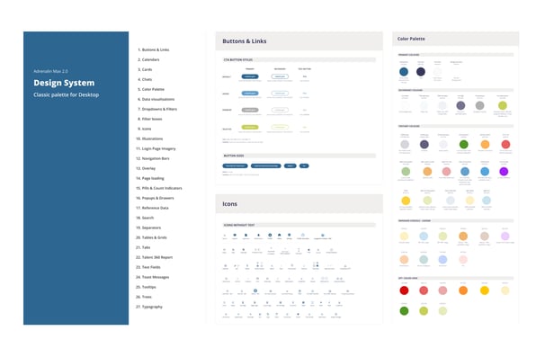
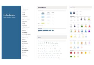
Design System
Ongoing Support
We designed a comprehensive superset of all potential features and fields the product could accommodate. Customisation requests have emerged as the product is being rolled out, ranging from simpler versions to industry-specific needs and even niche features. As we continue to support the client with design, here are some key observations I've made...
Users prioritize discoverability, even if it leads to a cluttered interface.
While users don't want to use MS Excel, they expect the product to function similarly.
Some users continue to focus on minimising click counts.
Numerous elements, both large and small, require thoughtfully designed empty states.
Even if the system intelligently pins frequent actions, users still prefer the option to pin them manually.
Project Impact
Biggest Learning
Next Time
Our redesign not only resulted in a continued engagement with this client but also led to:
50% increase in user adoption rates
32% decrease in sales conversion timelines
48% decrease in the development lifecycle
UX design is 90% about education and fostering genuine partnerships; only 10% is about the screens themselves. The best product outcomes arise when teams collaborate in co-design, grounded in mutual respect and trust.
I would design more compact layouts, as enterprise software often requires displaying many key information above the fold. Maintaining a balance of white space is crucial to avoid compromising the task area.
User Experience Designer
© 2024. All rights reserved.
leezamundaden@gmail.com
POSTS & PUBLICATIONS
Mumbai, India