
How we crafted a framework and blueprint that could help 300+ cancer hospitals in India
Detailed case study
My Role
Leading the project, Mentoring the team, SPOC for the client
Team
Principal Designer, Lead Designer, Sr. Designer, Jr. Designer, Program Manager, Sr. Oncologist
Timeline
1 month (2024); Blueprint & Framework shared with National Cancer Grid of India
Process
Research · Framework · Design · Testing · Style Guide
Design output is scalable beyond chemotherapy • Collaborated closely with doctors and nurses • Earned a returning client
Overview
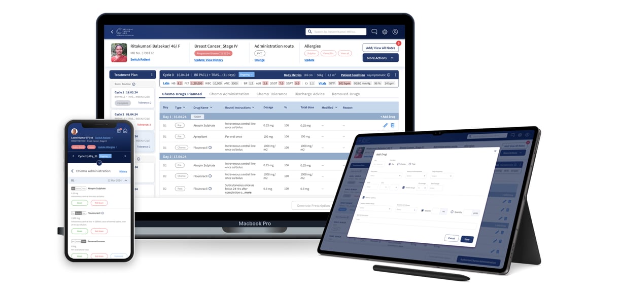
KCDO (Koita Centre for Digital Oncology) asked us to create a UX blueprint for chemotherapy management and a framework for software vendors to design treatment management systems.
Healthcare is notorious for being slow and sub-par in digital adoption. The inefficiencies and errors caused by this can be the difference between life and death. Our solution aims to streamline the transition from outdated or inefficient systems to a more effective digital platform.
Direct & Indirect stakeholders

You guys are a phenomenal team! The level of detail that you go into is amazing.
Founder, Koita Foundation

This is a great UI and UX! After some training, everyone will be able to use it.
Director, Tata Memorial Hospital

★★★★★
★★★★★
The Problem
Complex software frustrates healthcare; paper isn't ideal.
Healthcare professionals often dislike their computer systems, and for good reason. Treatment management software can be difficult to learn and can potentially double the time spent on updation. However, using paper records has problems like storage issues and accountability challenges.
There’s a lack of effective treatment management systems that prioritize user-centric design and seamlessly integrate into various healthcare settings.
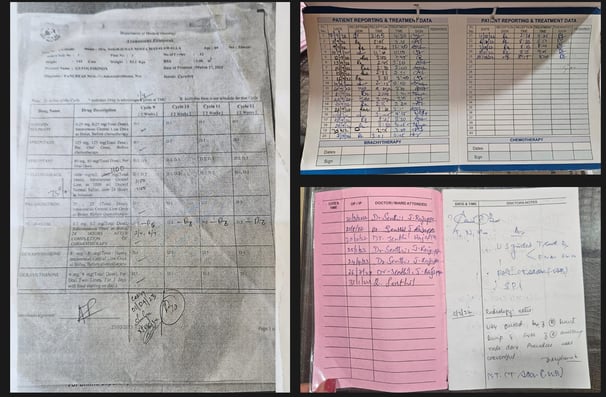
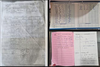
Handwritten Treatment charts - The most common weapon of choice currently
The cost of not adopting digital
The burden of paperwork
Information overload
Not enough time left to focu on patient care
The Constraints


Careless design can be the difference between life or death
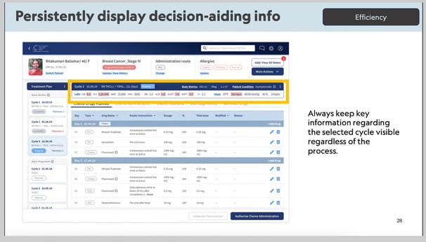
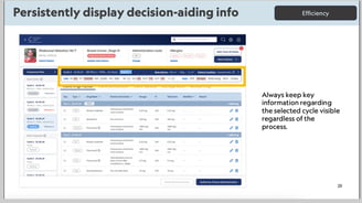
A lot of decision-aiding information should be upfront without looking cluttered
The blueprint & framework must be scalable & adaptable
What it Revealed
The system should be easily learnable and adaptable for healthcare professionals across a vast age range.
Doctors must have an overview of all the relevant and time-sensitive information about the patient.
The retrieval of historical data must be easy and fast.
Nurses should be able to make bedside updates to avoid having to make hand-written and often duplicate notes later.
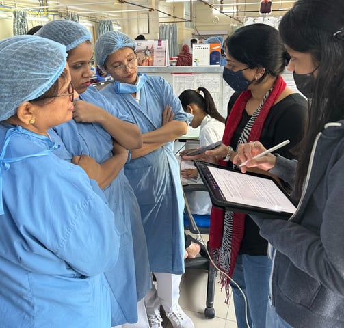
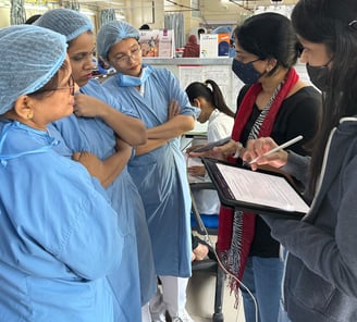
Research
Research interview with an Oncologist
Competitor Benchmarking

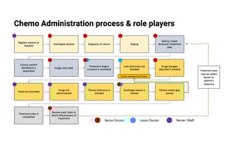
Process Mapping
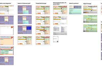
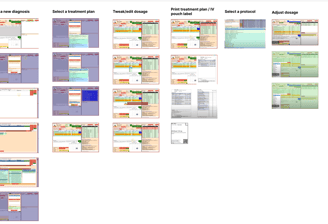
The Design Framework
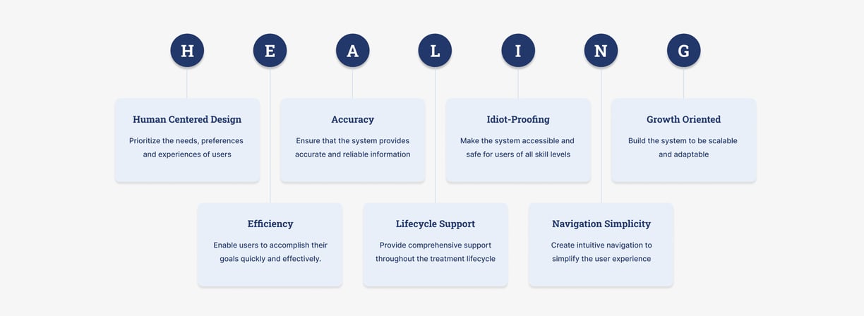
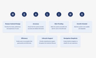
7 keys to best-in-class Clinical Systems.
Glimpses of how we adapted the Design Blueprint to the HEALING Framework

Design Explorations
The high stakes and ambiguities, coupled with various edge cases, demanded constant iteration to balance critical information with progressive disclosure. We had to account for diverse user demographics, ranging from tech-savvy Gen Z to seniors with different levels of digital literacy.
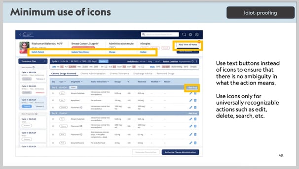
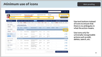
Given the system’s need for accuracy and efficiency, there was no room for decorative UI elements or unnecessary animations. Instead, our design explorations focused on creating a functional, intuitive interface that could effectively meet all users' needs.
Concept 1: Paper Chart Replica
Doctors wanted the system to mimic familiar paper forms for ease of use.
Large amounts of data couldn’t be entered directly into digital cells as efficiently as handwritten notes.
The need to access deeper layers for detailed input made the system cumbersome
Concept 2: Overview with cycle-specific details in the next level
The concept started with a summary of treatment cycles for a clear overview.
Users clicked to access detailed cycle information.
Once inside, the overview with critical information disappeared, leading to issues in decision-making.
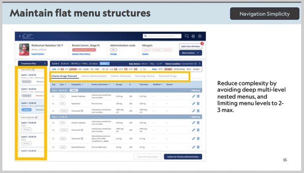
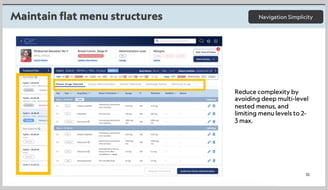
Concept 3: Horizontally laid out chemo cycles with tabs below
The concept featured three rows of tabs: protocols, cycles, and tasks.
This structure helped users understand their position in the treatment plan.
However, it lacked scalability and required excessive navigation without summarized data to track specific cycles.
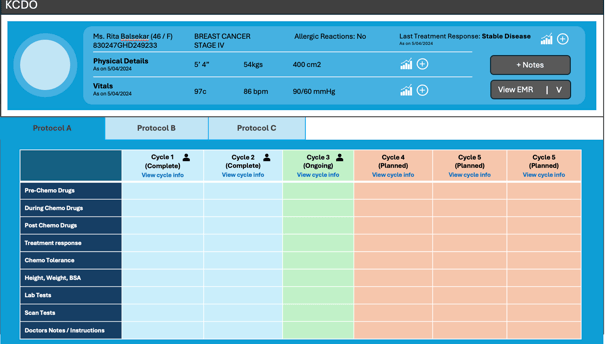
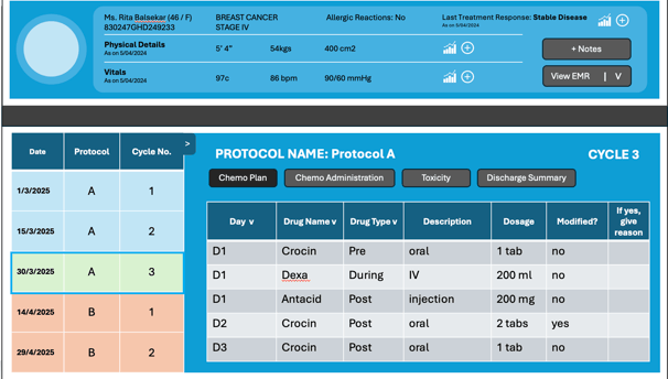
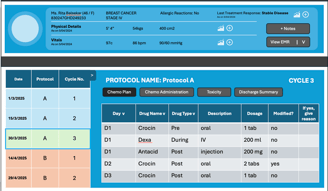
Concept 4: Vertically laid out chemo cycles with tabs on the side
Cycles were stacked vertically in tabs, allowing space for protocols, dates, and toxicity information while enhancing scalability.
The left task panel used horizontal tabs for organization.
This clean layout provided a clear treatment plan overview and simplified navigation.
Result: FAIL
Result: FAIL
Result: FAIL
Result: PASS
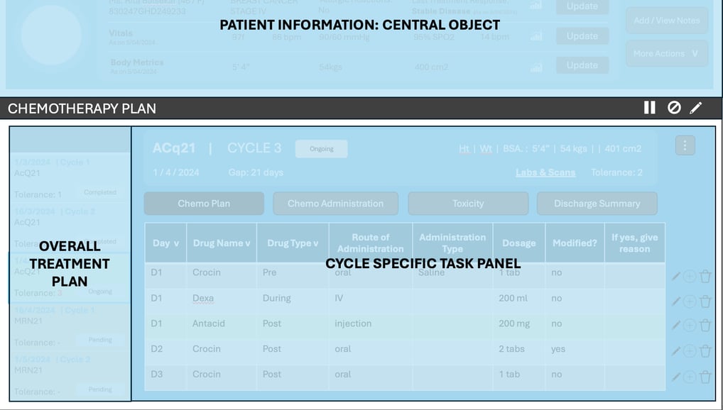
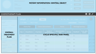
Object-Action-orientation: At the top of the screen, patient information remains consistent, serving as the central object. All patient-related actions are performed from panels below this section.
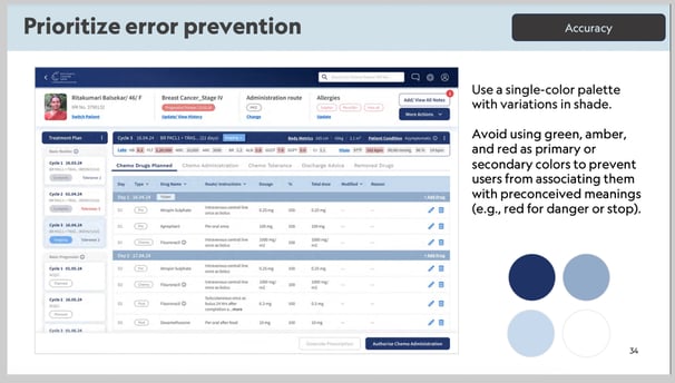
Colour palette: We used blue as the primary colour for the concepts, reserving green, amber, and red to indicate various statuses on screen.
Super admin rights: We designed the concepts with full access to all information and actions. The final design, however, will enable or disable content based on access control.
Common design decisions across all concepts
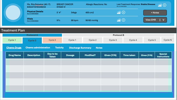
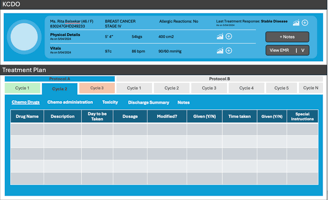
Final Superstructure of Blueprint for Treatment Management Systems
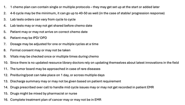
Ambiguities to consider while designing

Key Features of the Solution
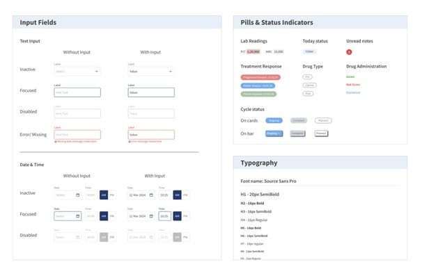
We developed a comprehensive style guide to standardize the visual and functional elements of our chemo management portal. This guide serves as a single source of truth for internal teams and external vendors, ensuring consistency in design and faster development. It outlines key UI components, typography, color usage, and interaction guidelines.
Key benefits:
Improved collaboration
Reduced design inconsistencies
Streamlined implementation
Style Guide
User Testing insights that improved the design
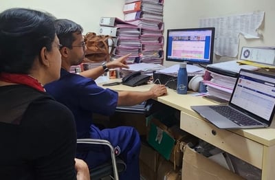
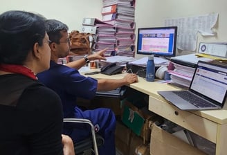
We tested the prototype with oncologists and nurses.
Project Impact
Biggest Learning
Next Time
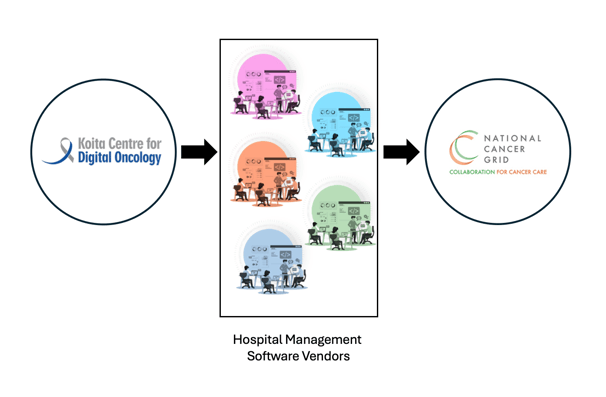
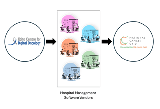
The detailed document of our Design Framework and Blueprint has been made publicly available. We also presented it to key software vendors who design hospital management systems for 300+ government institutions within NCG.
I learned to balance being both an expert and a beginner. My UX skills were solid, but healthcare brought new challenges, with its unique focus on the human side that other fields don’t usually have.
From the outset, I would include nurses in the research, as we later realized that they manage most of the chemotherapy. While they validated the design during testing, their early input would have made the design more holistic.
User Experience Designer
© 2024. All rights reserved.
leezamundaden@gmail.com
POSTS & PUBLICATIONS
Mumbai, India